

South African homes are stepping into 2026 with confidence, warmth, and personality. After years of safe neutrals and minimal palettes, homeowners are ready for colour that feels lived-in, expressive, and climate-aware. Whether you’re refreshing a lounge, styling a new apartment, or updating an Airbnb, these trends will help you choose colours that look good today and still feel right years from now.
Why Colour Matters More in 2026
Colour isn’t just decoration anymore; it’s a mood-setter and problem-solver. In sunny regions it manages glare and heat, in compact urban homes it creates depth, and in family spaces it hides wear while adding character. The 2026 palettes are practical, grounded, and distinctly South African, drawing from nature, heritage, and modern city life.
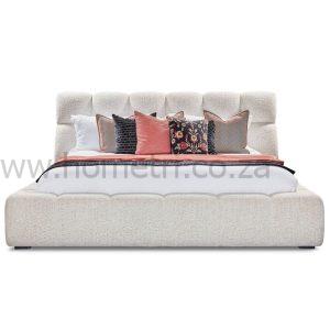
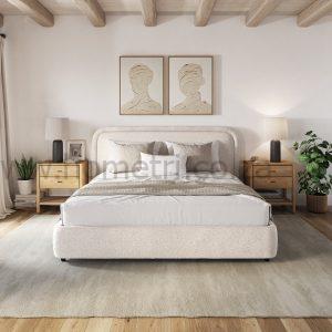
1. Earthy Neutrals with Depth
Clay beige, warm taupe, mushroom grey, and soft stone replace flat whites. These neutrals feel richer under natural light and pair beautifully with timber, leather, and textured fabrics.
Where they work best:
-
Living rooms and open-plan areas
-
Walls paired with darker furniture for contrast
-
Rental properties that need longevity
Why they win: They’re forgiving, timeless, and easy to layer with accent colours later.
2. Olive, Moss & Soft Sage Greens
Green continues its rise, but 2026 tones are muted and organic rather than bold. Olive and moss connect indoor spaces to gardens and courtyards, perfect for SA’s indoor-outdoor lifestyle.
Smart uses:
-
Feature walls behind sofas or beds
-
Upholstered accent chairs and ottomans
-
Kitchens and studies for a calm, focused feel
3. Sun-Baked Terracotta & Desert Rust
Inspired by Karoo landscapes and African clay, terracotta, rust, and muted burnt orange bring warmth without overpowering a room.
Try this:
-
Terracotta cushions on neutral sofas
-
Rust-toned ottomans in lounges
-
Clay-coloured walls in dining areas
Problem solved: Adds warmth to cool interiors without the heaviness of dark reds.
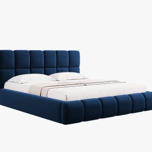
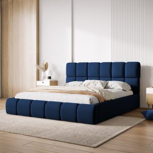
4. Deep Blues & Inky Charcoal
For those craving drama, navy, midnight blue, and charcoal deliver sophistication, especially in urban apartments.
Best pairings:
-
Light woods and brushed metals
-
Creamy whites for balance
-
Soft lighting to avoid harsh contrasts
Use with care: Great for feature walls, headboards, and statement furniture rather than whole rooms.


5. Soft Pastels—Grown-Up Edition
Pastels mature in 2026. Think dusty rose, powder blue, muted lilac, subtle, not sugary.
Where they shine:
-
Bedrooms and nurseries
-
Reading nooks and home offices
-
As accents in modern minimal homes
How to Apply 2026 Colours Without Overcommitting
-
Start small: Cushions, throws, or an ottoman introduce colour with minimal risk.
-
Anchor with neutrals: Let earthy neutrals do the heavy lifting; add colour in layers.
-
Think function: High-traffic areas benefit from mid-tones that hide wear.
-
Test in your light: South African sun changes colours, always sample first.
Tip: If you’re unsure, update furniture upholstery or window treatments first. It’s faster (and often cheaper) than repainting.
Make the Trend Work for Your Space
Whether you live in Johannesburg, Cape Town, or Durban, these palettes adapt easily:
-
City apartments: Charcoal, olive, and soft pastels keep spaces modern.
-
Family homes: Warm neutrals and terracotta add durability and comfort.
-
Coastal homes: Sage greens and powder blues echo the environment.
Ready to Refresh Your Home?
Bring 2026’s colours to life with pieces that fit your space and lifestyle. Explore custom furniture, curtains, and blinds to introduce trend-right colour without compromising comfort or quality.
Start with one room, one colour, one smart upgrade and build from there.